The registration and welcoming process is set to receive a visual update in the future, and we have a few sneak peeks of the upcoming design!
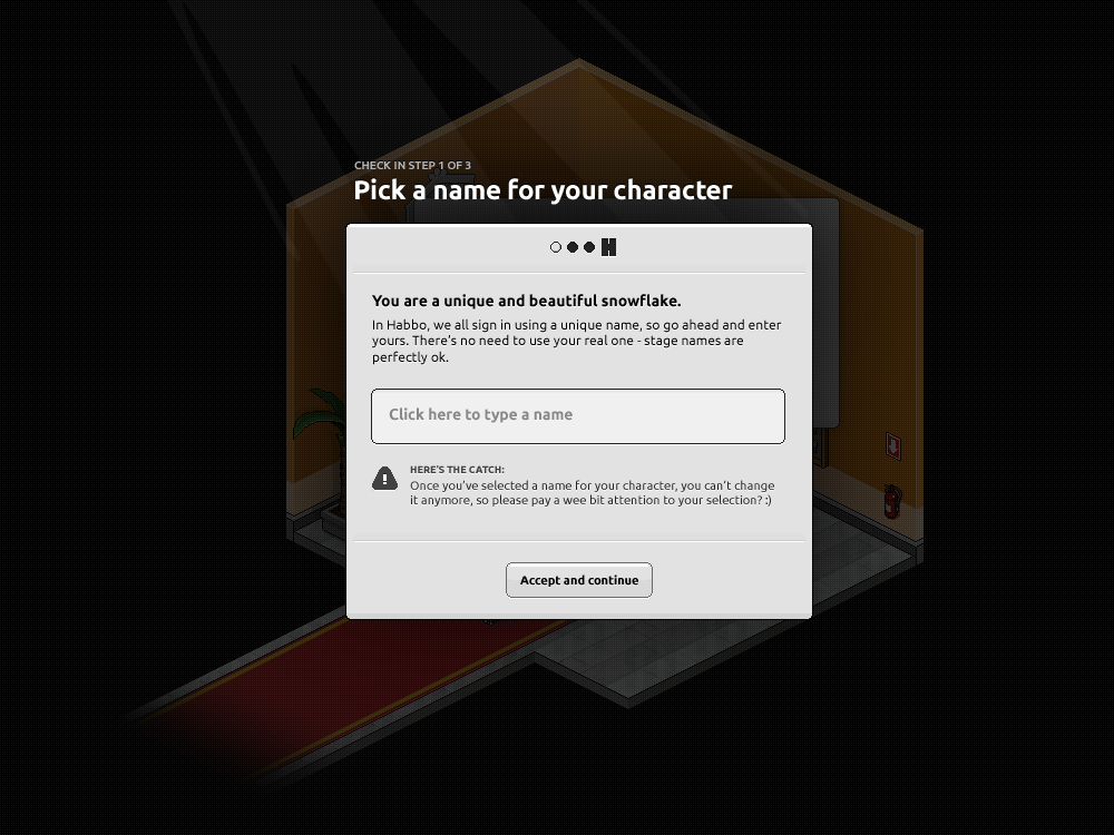
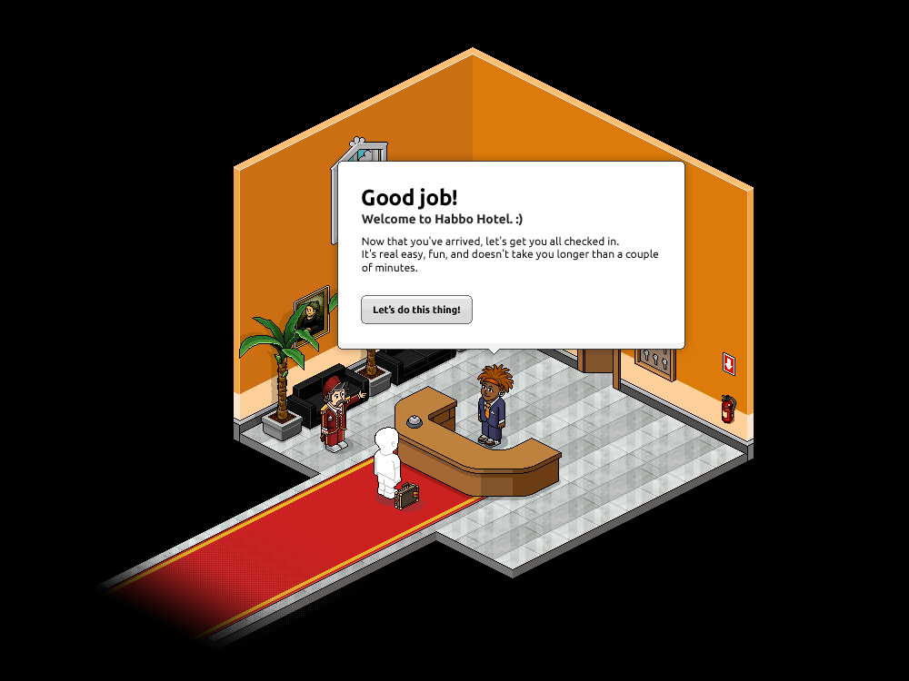
If you’re a new member then you’ll have probably completed the registration process, entered the hotel and ended up completely confused about what to do (don’t worry, we’ve all been there). In fact, I bet the large majority of you didn’t even think that the hotel had any “hotel-like” features. Well, all these confusions should hopefully be removed during the next UI update! Creative Director of UX Design staff member “Juho Paasonen” recently posted a few pictures of the potential welcoming concept on his Twitter feed. Here’s just one of the 3 images:

As we can see, this genuinely looks like you’re checking into a hotel (not just ending up in a random room) and it even provides the very “basic” players with instructions on how to navigate around the floor – just in case they try to use the arrow keys. The 3 images about the new welcome concept provide a lot more help and information than the current start up, which is simply a “You are here” button hovering over a user’s head until they switch rooms. The other 2 images can be seen:
* Here – http://www.habbox.com/assets/images//2012/06/21/P2qYy.png
* Here – http://www.habbox.com/assets/images//2012/06/21/GzdP.png
* All of these designs are still being developed so they may look different as a final product.
Here are a few comments users have left about these sneak peeks:
I like it. It’s a lot more interactive than the previous registration method. ~ Fifty-Six
I will register a new account for the sake of doing that ahah. Looks really cool! ~ Nick
That looks really good, I like the checking in bit! ~ Jssy
What do you think of these images? Will you be trying out the new registration method once it’s introduced? Share your view by clicking “Read More & Comment”!
Powered by WPeMatico
 (No Ratings Yet)
-
Events Timetable
-
Latest Wiki edits
-
Upcoming DJs
-
Staff of the Month
-
Latest Badges
-
Latest forum posts
-
Latest Comps
-


