Habbo2020: Our first taste of the User Interface
Last Saturday, I got access to the Beta for the first time. If you don’t know anything about this, where have you been?! Next month Habbo will be launching their ‘2020’ client. While most of the features are pretty similar, it’s a huge change from what we have now and is certainly going to take some getting used to.


It’s definitely a mobile-first design, but is it totally unusable?
In this article, you’ll be able to see some of my first impressions of the new hotel – particularly around the designs & icons that make up the user interface (UI) and how rooms are looking.
Read on to find out more!
A bit of history
As we probably all know, Habbo is redeveloping their game because next month, support is officially finished for Adobe Flash. Most browsers will stop allowing it, which means we won’t be able to play Habbo.
The new client is built on Unity, and is intended to not only be a new desktop app but to provide unified access between desktop and mobile. The app is currently run on Adobe Air, and last week we found out via an interview with Puhekupla that the new client will allow for cross-platform functionality (a “huge improvement for the game”), ready for players in early 2021.
First impressions
I have two computers for comparison. One I call my ‘Laptop’, which is a Toshiba Satellite with a second (very, very old) HP screen – the client looks the same on both these screens. The other is my Surface Pro 6, which looks very different. It’s interesting to compare how the new client looks on both. For reference here’s their screen resolution:
- Laptop: 1920×1080 resolution, apps at 100% scaling
- Surface: 2735×1824 resolution, apps at 200% scaling
I’ve been testing the Beta on both computers. The main difference I would describe between them is on my laptop, things are VERY BIG. On my surface, things are… spacey.
For example, here’s how the homepage looks on my two screens. The one on the left is my laptop, and the right is my surface. The icons seem much better sized on the right IMO, but everything’s so empty. Everything on the left is SO BIG.
-
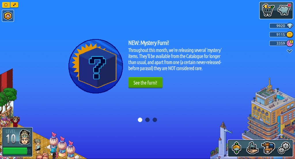
The homepage on my laptop -
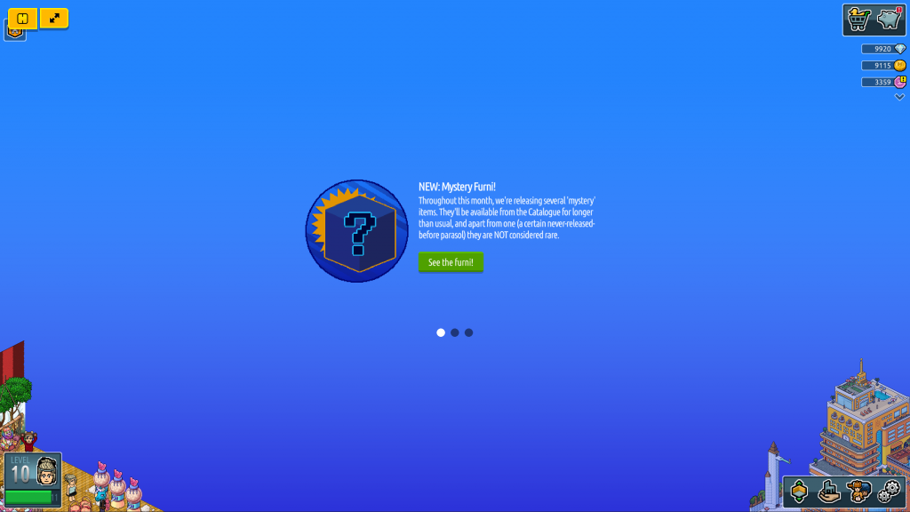
The homepage on my Surface
My first impression logging onto the Beta was literally ‘O M G this is so big’. Having now spent a while on it, I’m sort of getting used to it, but I really don’t love it.
When you go in a room for example, it displays as twice what I’d call “normal” size. And even though the homepage is a lot smaller on my Surface, the room is even bigger – a stark contrast with the smaller icons.
-
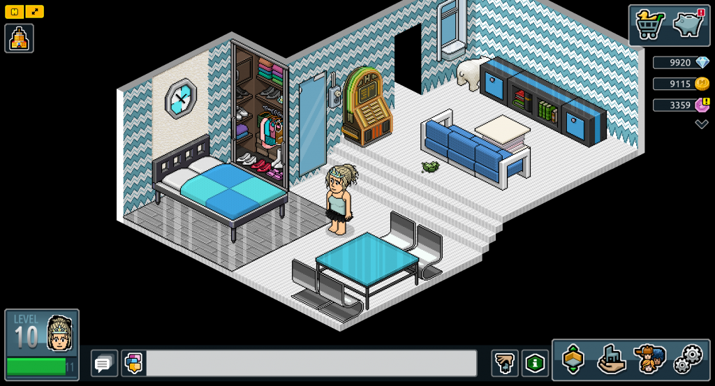
Rooms on my laptop -
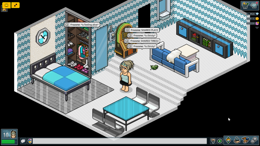
Rooms on my Surface
Habbo is a pixelated game. That’s it’s charm! So many pixel artists have been born from Habbo. Pixel art was my first foray into graphics, now that’s part of my career IRL. Although new Habbo is mostly pixels still, everything’s at 2x size and feels wrong. I visited the official Picnic room to compare what it looks like on the new client and ‘current’ Habbo.
-
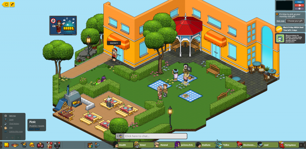
Picnic in the current Habbo -
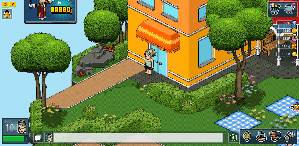
Picnic in the new Habbo
Yes, you can zoom out on new Habbo, which makes it look pretty much the same (yay!). But by default, every time you go in a room, it changes you back to that ‘zoomed in’ view (not yay.) If you zoom out, it still looks BIG on my laptop as all of the icons, buttons and speech bubbles are the bigger size.
I can’t help but wonder what this means for huge rooms – like agency hubs and fansite badge and event host rooms. Most players won’t be able to see the majority of the elaborate large furni-filled rooms we’re used to, especially with the automatic “follow my Habbo” setting permanently enabled – just a small section at a time. Will this mean room building as we know it will adapt to smaller spaces?
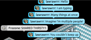
Speech bubblesSpeech bubbles are one of my biggest concerns of the new UI. It’s hard to test on Beta as there’s not a ton players in any room at the same time, but I can only seem to see a maximum of 6 speech bubbles at one time.
Imagine being in a fansite event, a public room or an agency! You’d literally never be able to keep up with the conversation. You can’t make the icons or speech bubbles ‘permanently’ zoomed out. Using the mouse/scroll wheel or browser settings only affects the room, furni and Habbos in the room. This screenshot is from the top of my browser to the ‘newest’ speech bubble.
I’m also having to get used to clicking the speech bar each time I want to talk. I keep typing and it goes nowhere! I have noticed there’s a shortcut if you press ‘T’ it activates the bar. I suppose this is like many other games, but it’s still a change.

Good features!
It’s not ALL bad though, and I want to highlight some of the things I actually like about the new UI.
I actually really like the new icons – it looks like a lot of work has gone into them and it feels like pixelated Habbo but a bit more modern. It’s just a shame the same attention to detail hasn’t gone into things like the profile outline, speech bubbles, stretched images in the looks editor etc.
Some of the new icons in the new client

Strange pixelated outlines in speech bubbles and in the profile section and a stretched-out afro
And despite the size and how it takes up most of the screen, I even quite like the new inventory, shop and wardrobe UI. There’s a lot of new features (particularly in the inventory) that’s going to make sorting your ‘hand’ (as I still call it, after all these years) so much easier.
There’s new categories in the shop and BC, there’s new wardrobe slots… these are all highly requested features that I’m happy to see.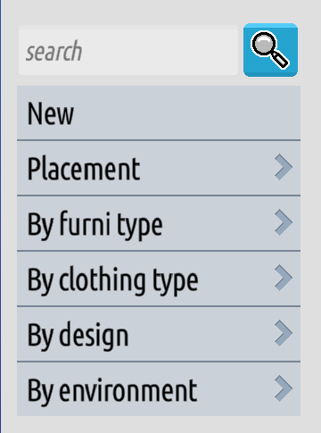
Speed
The other massive, debilitating problem of the new client is its speed. This isn’t #1 in this article because I’m hoping and assuming it’s just because it’s a Beta client and once it’s on the real servers, it’ll be quicker.
But OMG it’s so slow.
Watch above to see just how slow loading my wardrobe is. And you’re going to have to trust me here, but this video is showing the quickest it’s loaded in days!
It’s taken me anywhere from 30 seconds to 10 minutes to load the Hotel itself, and sometimes the inventory just does not load. Furni won’t drop in a room. Popups won’t appear. And the wardrobe can be so glitchy! As some Habbox members will tell you, I spent a week RAGING because my iconic tiara just would not load any time I opened the wardrobe (thankfully it has now!)
Final thoughts
After a week of playing, I am starting to get used to the ‘big’ UI and it’s not as much of a turn-off as I thought it would be. I can probably get used to the icons. I don’t think that the huge speech bubbles work in reality, and I really hope that we eventually get a setting to set our “default” zoom option.
That actually almost seems an intended feature because on my Surface, when I make the browser smaller, I actually see it in “small” or “normal Habbo” mode. I wish it looked like the screenshot below all the time.
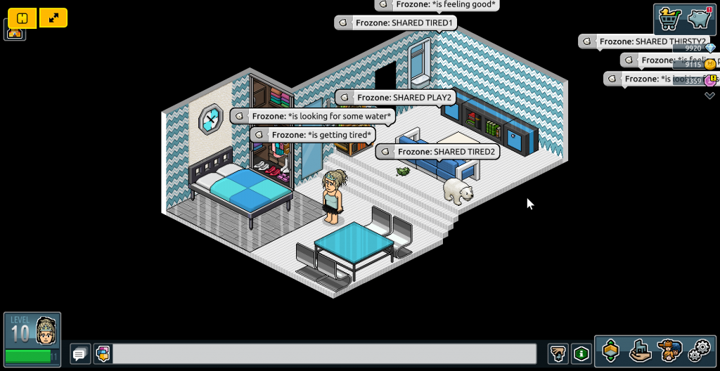
What do you think of the new Habbo UI? Let us know your thoughts below!

 7
7


Thank you for sharing so many pics! I’ve missed your streams so far and I’m loving that you’ve shared so much!
I think (like you’ve said) it’s just a matter of getting used to some of it. I’m not COMPLETELY looking forward to having to get used to it, but of all the things changing the interface doesn’t seem completely awful? Or at least not yet, lol!
It is interesting to see habbo on your two different laptops; makes me wonder what most of us will be using going forward or if anyone has plans on changing how they play.
Great article, thanks for sharing everything 😀
Having the pixels zoomed in 2x as DEFAULT kind of suggests that it is the most convenient way to play the game, which isn’t the case as it makes you spend a lot of time panning the camera if you’re in a large room — at least it is reversible as you’ve shown. Thanks!
PS: Changes scare me
Glad they help!! I wanna take a load more and upload them in a gallery soon so everyone can see a load more of all different places.
I really don’t like how big everything is and it’s so mobile-first (and I reaaaally hate the Habbo app) but honestly from a design perspective ALONE I think most people will get used to it. I think most things are gonna be worked on & improved going forward anyway. Having settings like “set your default zoomed in” would make the experience so much more seamless from ‘old’ Habbo to ‘new’ Habbo imo, so I wish they would implement that.
It’s just the speed thing really 🙁