

The fully comprehensive guide to profitable trading.
In this edition of Market Watch, a very important topic to merchants who deal with slightly higher value items and who are interested in investment shall be covered, that of understanding, reading and analysing the marketplace. There shall not be any item recommendations this week however, due to events in rooms still not returning, and therefore the rest of the article shall be longer to compensate.
 The first image shows us one of the most basic things to read and understand before we can delve further into the topic. The offer count shows how many of the item are in the marketplace at any given moment, in this case 14 Grey Fountains are available. The cheapest price shows us the lowest priced offer of these 14 Grey Fountains. Finally, the average price in last 7 days shows us the average price of all of these Grey Fountains that have been sold in the marketplace.
The important thing here with this data however, is the analysis of it when trying to buy and sell items. The main important point when buying to remember is that whichever one of the cheapest price or average is lower is the value you should be taking a value from in the first place. However an important point to look at from this is that if there are a lot of offers in the market, and the price is significantly lower then the average then this could mean that they are being used to lower the average price, so care should be taken in buying in these cases. Do not be fooled however into believing that because the cheapest price is higher, the item is rising in price, as this is often someone just trying to make sneaky profits. In order to tell if it as actually rising, other graphs are needed to also look at.
 The next image shows us the average sale price during the last 30 days. This plots the average selling prices on each day, and shows it in a graph, allowing conclusions to be drawn as to whether an item is rising, falling, jumping up and down erratically or remaining relatively still. One problem immediately noticed is that these average sale prices do not just go in a straight line up or down normally, and this can be explained via a few different reasons.
Firstly, this item may just have an erratic sale price, meaning it never has a stable price that can be pinpointed as a good guide price. Items like this will normally have changed quite substantially in a value in the space of a few days, but are generally very risky to invest a lot in.
The other main reason is that of supply and demand. When supply of an item is low all over Habbo, people will generally look to the marketplace to try and get the item. Some players will naturally put high offers into the marketplace to try and get these people when they notice a low supply, and this means if they are desperate they may often pay far higher then they would normally do. This can result in large peaks  as shown on this graph for the Grey Fountain, which normally only last for a day or two before supply has returned to normal.
In the other image of this graph, a black line has been plotted through the graph, showing how to analyse whether prices are falling or rising. In general this is a very simple job to do, but there are ways of creating a more accurate analysis than the simple line of best fit shown on the left. The general idea is to get a representative line to go through the graph, covering the points best as you can, so that a price rise or fall is evident. The best method for this is using a 3-point average, where every point on the graph has its point averaged with the points either side of it, and this average is plotted onto the graph, connecting all these averages at the end. This will undoubtebly create the best representation and shows whether or not the price truly has been rising or falling within the last month.
This next image shows the trade volumes each day for the last 30 days. Although it doesnt serve the same analytical purpose as the other graphs and data, this still is very useful and important, as it allows you to see if an item does indeed sell well or not, and whether or not it has been selling in large quantities at peak prices, which is generally 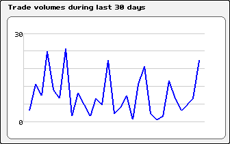 how the supply and demand and erratic price analysis of peak prices is differentiated between. In the case of an eratic price the trade volumes are far less likely to have such a great difference from other trade volumes compared to with the case of supply and demand. Again a 3-point average can be used here to work out on average whether trade volumes are increasing or decreasing, but a more useful idea is to plot a horizontal line across the graph to work out a mean trading volume, showing you generally how well an item sells. A final point to make here is this graph can also be incredibly useful in working out whether or not to put certain items in marketplace to sell while spending a few days buying stock, as it will show the likelyhood of your items reaching the front of the offer queue and selling before the 2 day limit is up.
If you would like to see any particular topics covered in the next edition, or have any questions you would like answered, please leave a comment below.
And now for the clue for the Crossword Challenge.
Clue 7: Over how many days does the average price cover? (5 letters) _ _ _ _ _
Powered by WPeMatico
 (No Ratings Yet)
-
Events Timetable
-
Latest Wiki edits
-
Upcoming DJs
-
Staff of the Month
-
Latest Badges
-
Latest forum posts
-
Latest Comps
-
