☼Habbo International Airport☼
Owned and created by .:Gabbana:.

Introduction
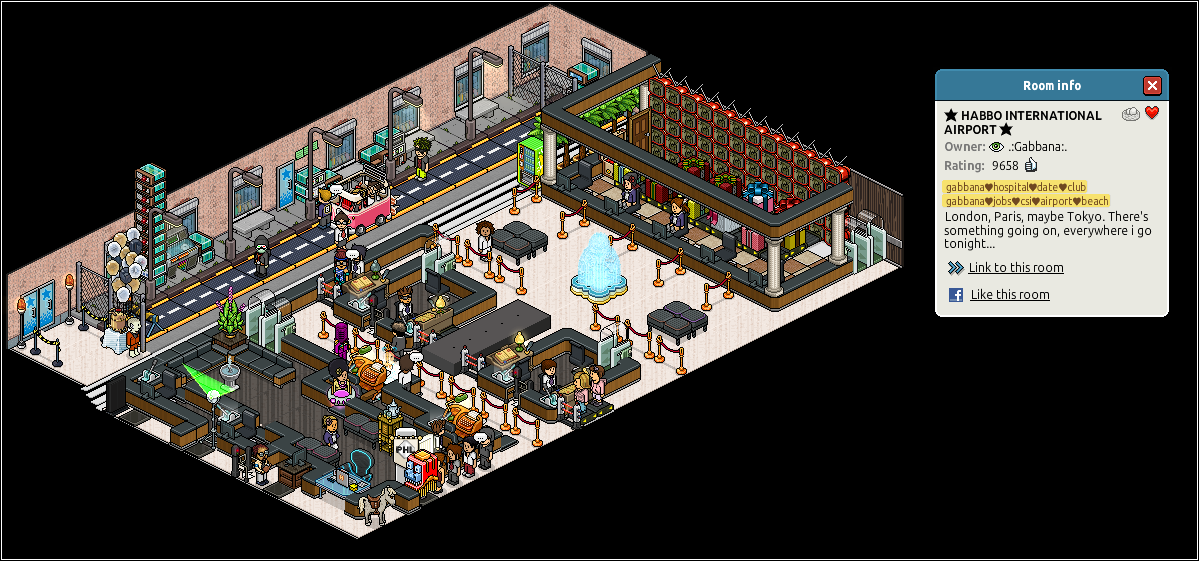
Whether it’s a family vacation,business trip or a permanent relocation to a different country, you can be sure that ‘Habbo International Airport’ will provide all this for you! With a comfy executive lounge,tightly-controlled security area and nicely decorated baggage area, you can be sure that this is truly a well-decorated airport just waiting to fulfill your dreams. The room initially presents a fairly classy and stylish look with the use of lots of executive and boutique furni, but it also manages to fulfill a ‘real-life’ comparison via the use of urban furniture outside the airport.
Design Pros
For a room this size, the amount of pros is very good! Where on Earth shall I start…
The ‘outside’ of the airport has managed to capture a typical stereotype of the real world perfectly. The urban walls,benches, sidewalks, street lamps, fences and trash cans suit the ‘outside’ incredibly well and are a good choice of furniture range for the ‘outside’ of the airport in order to create a real life comparison. Also, although you cannot tell from the screenshot, the “car” moves back & forth via the use of wired – a simple addition but also a cute addition.
The ‘baggage’ area also has a few good points surrounding it. The executive bars combined with the pillars look absolutely amazing – they really do work well together as stylish and classy furniture, and thus bring a professional atmosphere to the room when combined with the ‘black chairs’ behind the desk . The marble and brown tiles also seem to work rather well in an airport – something which you probably associate with a cinema instead.
Finally, the ‘security’ and ‘check-in’ area! Although it seems fairly crowded at first, there are a few good designing skills in-practice here. The wired has been used well to make it easier for passengers and staff to open the gates without a user needing rights… quite simply an essential for any popular room. The security checkpoints have also been created in an imaginative manner – e.g. the use of a spotlight for a scanner, a solarium for an x-ray etc. This is showing a fantastic skill of using other objectives to improvise and incorporate into a room instead of using generic furniture (even though ‘Airport’ furniture hasn’t actually been created…).
Also… I just have to say this. The silver bird bath looks stunning!!!
Design Cons
Yes… unfortunately these have occurred as well! There are a few design cons in this room which are stopping the room from potentially receiving such a high rating from us.
The wired: I really cannot stress on this point enough… WIRED DESERVES TO BE HIDDEN! Wired is not the most attractive (even though it is useful) furniture range in the world and it can often make a room look fairly unorganised if not hidden properly – a good example being this airport. It has been placed in stacks in random places in varying heights, which is quite frankly ugly. Yes, there may not be enough space to hide all the wired – but some attempt could be made to tidy it up and potentially place it all into 1 space!
The TVs: The TVs may be stacked and arranged correctly but they still lack in a sense of style. They simply look like a huge block of items which isn’t incredibly appealing – providing gaps between every 2 or 3 columns of TVs would definitely make this look better and potentially more interesting. Also, I’m given to believe that baggage shouldn’t be blocking the TVs every 3 seconds.
Balloon machine: This is ridiculously placed… that’s all I can say quite frankly. It should be moved towards the centre of the room as opposed to being placed in a small, bleak corner.
Finally… the banana drink machine and palm trees! These are placed rather randomly… they don’t quite belong in an airport like this anyway. The palm trees are also placed outside, which is defeating the purpose of an urban view outside and completely contrasts the idea. The banana drink machine should be placed inside the staff lounge (by ‘security’) as opposed to between a road and the baggage area.
Room Rating
On behalf of the Habbox team, I give this room a rating of 6.5 out of 10! It is not a complete catastrophe and certainly does contain a lot of unique and imaginative designing features inside it – but there is still room for improvement.
I have given the room this rating due to the owner’s ability to uphold a classy and sophisticated theme throughout the interior of the airport whilst comparing the outside to a realistic urban airport – a good skill to conquer. The owner has also managed to improvise with other items (e.g. spotlights) to create the items you would find in an airport but cannot find on Habbo (e.g. scanners) which is a very impressive skill when it comes to creating a room.
The most pleasing thing about the room is the amount of space in the room. This can lead way to lagg, but ultimately it makes the airport seem more life-size and is much more spacious for people who wish to hang around and chat before catching their flight!
Improvements
There is not much to comment on for improvements, as most have already been suggest above in ‘Design Cons’. However, here is a summary paragraph;
Although the room does uphold a classy and stylish appearance, there are many ‘fatal’ mistakes which are deterring it from achieving a high score. The owner needs to make every attempt they can to hide the wired or place it into an organised space so that it doesn’t look like it has been spewed across the room. He/She should also try to ensure that furniture is placed into a space in which it should belong – e.g. the balloon machine and banana drink machine are placed incredibly randomly and don’t suit their places.
On a final note – thank you to the owner for creating this room!
You’ve heard our opinion, now it’s time to hear yours! Share your opinion on this room by clicking ‘Read More & Comment’!
Powered by WPeMatico


 (No Ratings Yet)


