This week I have chosen to focus on two well remembered features of Habbo.
The Casino:

Casinos were a big hit within Habbo. Most users used them at least once. Over the years casinos changed dramatically. The traditional ones would have Petal Patches, Thrones and lots of other expensive furniture. This was to show the visitors the wealth that the owner had. As years went on and more furniture lines were introduced, people started to design them in different ways. You could get outdoor looking casinos and many other unique styles. One thing I always noticed with casinos was that stacking was a feature that was never removed. Either stacking Yukkas, Dinos and other wealthy furniture around the walls or stacking the dice in funky ways. They always looked amazing.
Casinos have always been controversial on Habbo as many people were known to scam by not giving prizes etc. The gaming authority ‘SKAT’ also claimed that it was illegal to gamble on Habbo. In April 2014, only a year ago, it was announced that you could only have 3 random chance items in your room at any time. If you had more a pop-up would appear and the item would not work.
Since then the number of users has dropped and furni prices for items which were used regularly in casinos such as Thrones have dropped significantly in price.
What are your thoughts on the casino ban? Do you agree with the ban or do you wish they would bring some element of gambling back?
The Old Console:

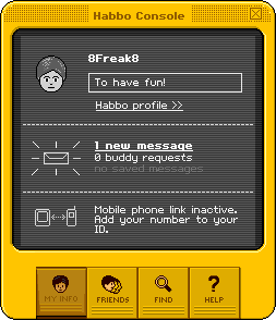
The console is a feature that has been on Habbo since it began. It is still there today but looks a million times different. It is used to manage your friends list, to receive messages and to see where in the hotel your friends are.
Back in the good old days, the console was yellow. You could talk to friends via a message that would pop up similar to texting. However, you couldn’t see what you had previously said so sometimes it got a little bit confusing. Unlike today, you couldn’t follow your friends. You could see where your friends were but it was very vague. It was either the name of the public space if they were in a public room, or if they were in user-made room it would not say the room, instead it would just show that it was a user-made room ( I can’t remember the actually phrase woops!).
Changes happened quite regularly on the console. This includes adding instant messaging and ability to follow users. When Beta was introduced the console looked very similar to how it does now, but in the traditional yellow colour. In 2013, Habbo removed the yellow colour and replaced it with blue.
In my opinion, I loved the old style console. It was just awesome. I think I just liked the old style Habbo in general to be honest.
What is your opinion on the old console? Would you prefer it to be that simple again or do you prefer the current, more modern design?
Did you enjoy this weeks Throwback Thursday? Have your favourite feature or furni range written about by sending a PM to Articles on the forum!
Powered by WPeMatico


 (No Ratings Yet)


